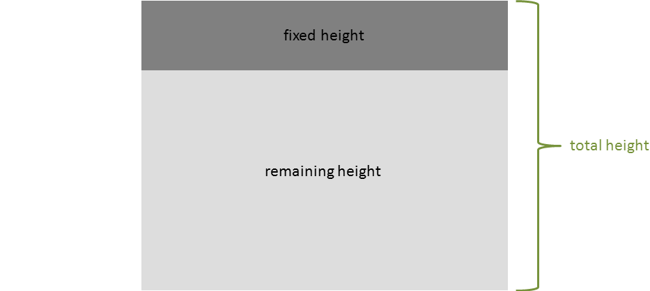
You would think that such a basic problem would be solved within seconds of try and error or after a small trip to our favorite search engine.

But I personally had to come to the conclusion that it is not that simple, at least when you want to have a “CSS only” solution. To this day I stumbled across various approaches to solve this problem.
Listen to some relaxing music while reading my blog post
Solution 1 – Flex
This approach makes use of the fairly well supported flexbox layout.
HTML:
1 2 3 4 5 6 7 8 9 10 11 12 13 14 15 16 17 18 19 20 21 | <div id="outer"> <div id="inner_fixed"> I have a fixed height </div> <div id="inner_remaining"> I take up the remaining height </div> </div> |
CSS:
1 2 3 4 5 6 7 8 9 10 11 12 13 14 15 | #outer { display: flex; flex-flow: column; height: 100%; } #inner_fixed { height: 100px; background-color: grey; } #inner_remaining { background-color: #DDDDDD; flex-grow : 1; } |
JSFiddle
pros
- easy to implement
- modern
cons
- browser support
Solution 2 – Absolute Positioning
This approach uses absolute positioning to “stretch” the div between two given heights.
HTML:
1 2 3 4 5 6 7 8 9 10 11 12 13 | <div id="inner_fixed"> I have a fixed height </div> <div id="inner_remaining"> I take up the remaining height </div> |
CSS:
1 2 3 4 5 6 7 8 9 10 11 12 13 14 15 16 17 18 19 | html, body { height: 100%; width: 100%; margin: 0; } #inner_fixed { height: 100px; background-color: grey; } #inner_remaining { background-color: #DDDDDD; position: absolute; top: 100px; bottom: 0; width: 100%; } |
JSFiddle
pros
- easy to implement
- intuitive
cons
- tedious to maintain (hard-coded positions)
Solution 3 – Tables (or rather display: table)
By utilizing the property of tables to distribute the given space between the rows and assigning fixed heights to some element, the other elements end up using the remaining height.
HTML:
1 2 3 4 5 6 7 8 9 10 11 12 13 14 15 16 17 18 19 20 21 | <div id="outer"> <div id="inner_fixed"> I have a fixed height </div> <div id="inner_remaining"> I take up the remaining height </div> </div> |
CSS:
1 2 3 4 5 6 7 8 9 10 11 12 13 14 15 16 17 18 19 20 21 22 | html, body, #outer { height: 100%; width: 100%; margin: 0; } #outer { display: table; } #inner_fixed { height: 100px; background-color: grey; display: table-row; } #inner_remaining { background-color: #DDDDDD; display: table-row; } |
JSFiddle
pros
- rather “clean” solution
- no hard-coded values, other elements can change their height
cons
- might cause some side-effects with the layout
Solution 4 – CSS3 calc
This approach makes use of the new css function calc(link) to assign a height that is calculated from the total height minus the height of the other elements.
HTML:
1 2 3 4 5 6 7 8 9 10 11 12 13 | <div id="inner_fixed"> I have a fixed height </div> <div id="inner_remaining"> I take up the remaining height </div> |
CSS:
1 2 3 4 5 6 7 8 9 10 11 12 13 14 15 16 | html, body { height: 100%; width: 100%; margin: 0; } #inner_fixed { height: 100px; background-color: grey; } #inner_remaining { background-color: #DDDDDD; height: calc(100% - 100px); } |
JSFiddle
pros
- easy to implement
- less code than the other solutions
cons
- the calc function is rather new (no support for older browsers)
- tedious to maintain (hard-coded height)
There are also other ways to archive this effect e.g. by pushing down the lower element by an floating upper element or using the new css grid but nowadays I tend to use flex and the other above solutions as needed.
Excellent presentation :
– no blabla
– clear HTML and CSS code
– direct link to a live demo (jsfiddle.net).
All websites should display information like that !
Excellent post, thanks a lot!
I used solution 4, the css3 calc solution and changed the height expression – like Ahmad – to calc(100vh – 255px)…
Thanks! very useful the flex solution
Great with fixed height in the top
This is really a good article which helps me a lot in my work.
but i have a questions.
> There are also other ways to archive this effect e.g. by pushing down the lower element by an floating upper element
could you please post a example about this way? I am curious how this is achieved.
See http://jsfiddle.net/S8g4E/5/ (source: https://stackoverflow.com/a/11226087/441907)
U can use height: calc(100vh – 100px);
This would work if you wanted to have the other div occupy the remaining viewport height.
Its Simple And Best Hats Off bro .
It’s 2018, I think nowadays a better solution would be flex. i.e. display:flex;flex-direction:column for the parent container and flex: 1 0 auto; for the child.
The display:table solution helped me, thank you so much for posting this!!
The problem with these solutions is that as soon as the content in the bottom div becomes too tall for the container, you can’t bound it with a scrollbar. Here’s a more robust solution and demo.
This is an interesting solution for the sticky header problem! I like that the scrollbar only spans the overflowing container.